- Hyland Connect
- Platform
- Alfresco
- Alfresco Blog
- How to customise the search component results
- Subscribe to RSS Feed
- Mark as New
- Mark as Read
- Bookmark
- Subscribe
- Printer Friendly Page
- Report Inappropriate Content
- 1.Generatethe scaffolder ADF app
- 2.Add thecustom search component
- 3. Template - search-demo.compoment.html
- 4. Logic - search-demo.compoment.ts
- 5. Add the route- app.module.ts
- 6. Improving the style
All the code presented in this article is open source and you can find it in our ADF Examples repo.
1.Generate the scaffolder ADF app
The easier way to start creating a custom adf app is from the adf app generator if you want know more on how to use it you can read it here.
Thanks to the generator we are able to get a simple working app with all we need and chose from the configuration. In this case we have chosen only to generate the content service components.
Once the generator has done its work you will have an application running by default on port 4200 but if you want change it editing the .angular-cli.json file as we did here.
Now you can simply run "npm start".
[generated the project for ADF 2.0]
2. Add the custom search component
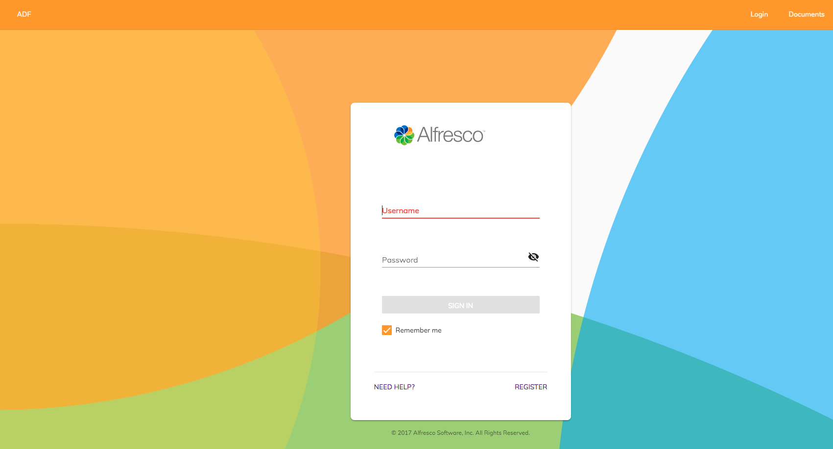
The npm run start command will takes a couple of seconds, and you will automatically open a browser to with the default login page :

Now we can add our custom search code component which will be responsible to shows our search results.
- Run the following command using the angular cli from the project root :
ng g component search/search-demo --module app --flat --style=scss
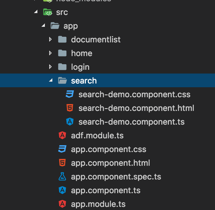
- That will generate for you a new search component into the app folder as the image below .

Now that we have our component we will shape our template. To keep it simple we can start creating a simple list using the material design list component to show the results.
3. Template - search-demo.compoment.html
This is how the custom template that you need to copy in your search-demo.compoment.html template:
<div>
<h3>Example of how customise search results</h3>
<div id="container-for-custom-input">
<span> Try to perform a search : </span>
<input matInput
type="text"
id="custom-input"
[(ngModel)]="searchTerm"
[searchAutocomplete]="auto">
</div>
<div>
<adf-search #auto="searchAutocomplete">
<ng-template let-data>
<mat-list>
<mat-list-item
*ngFor="let item of data?.list?.entries; let idx = index"
id="result_option_{{idx}}">
<h4 mat-line id="result_name_{{idx}}"
class="adf-search-fixed-text">
{{ item?.entry.name }}
</h4>
<p mat-line class="adf-search-fixed-text"> {{item?.entry.createdByUser.displayName}} </p>
</mat-list-item>
<mat-list-item
id="search_no_result"
data-automation-id="search_no_result_found"
*ngIf="data?.list?.entries.length === 0">
<p mat-line class="adf-search-fixed-text">{{ 'SEARCH.RESULTS.NONE' | translate:{searchTerm: searchTerm} }}</p>
</mat-list-item>
</mat-list>
</ng-template>
</adf-search>
</div>
</div>Some note that maybe you can find useful from the template above.
1. Via variable template we are able to associate a simple input text element to perform the search onto alfresco .The directive below is needed in order to execute the bind form the input text field to the search:
[searchAutocomplete]="auto"2. The auto variable is the variable which contains our search component :
<adf-search #auto="searchAutocomplete">4. Logic - search-demo.compoment.ts
Our .ts file is pretty much empty, all the logic has been already implemented by us in the adf-search component .
You need the code below in your search-demo.compoment.ts:
import { Component, OnInit, ViewChild } from '@angular/core';
import { NotificationService } from '@alfresco/adf-core';
import { SearchComponent } from '@alfresco/adf-content-services';
@Component({
selector: 'app-custom-search',
templateUrl: './search-demo.component.html',
styleUrls: ['./search-demo.component.scss'] })
export class SearchDemoComponent implements OnInit { searchTerm = ''; ngOnInit() { } }5. Add the route - app.module.ts
In order to see if our new component works correctly we need to bind it in the app.module.ts router.
Open the app.module.ts and add the following route in the router:
{
path: 'search',
component: SearchDemoComponent,
canActivate: [ AuthGuardEcm ]
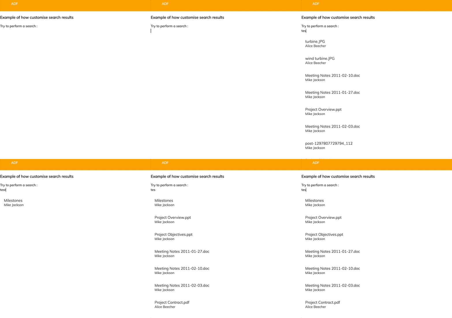
}And now you can navigate to http://localhost:YOUR_PORT/search in your browser and see the result:

6. Improving the style
Now we have a simple custom list of search results displayed with a simple material design list, but what if we want to improve the style of our list?
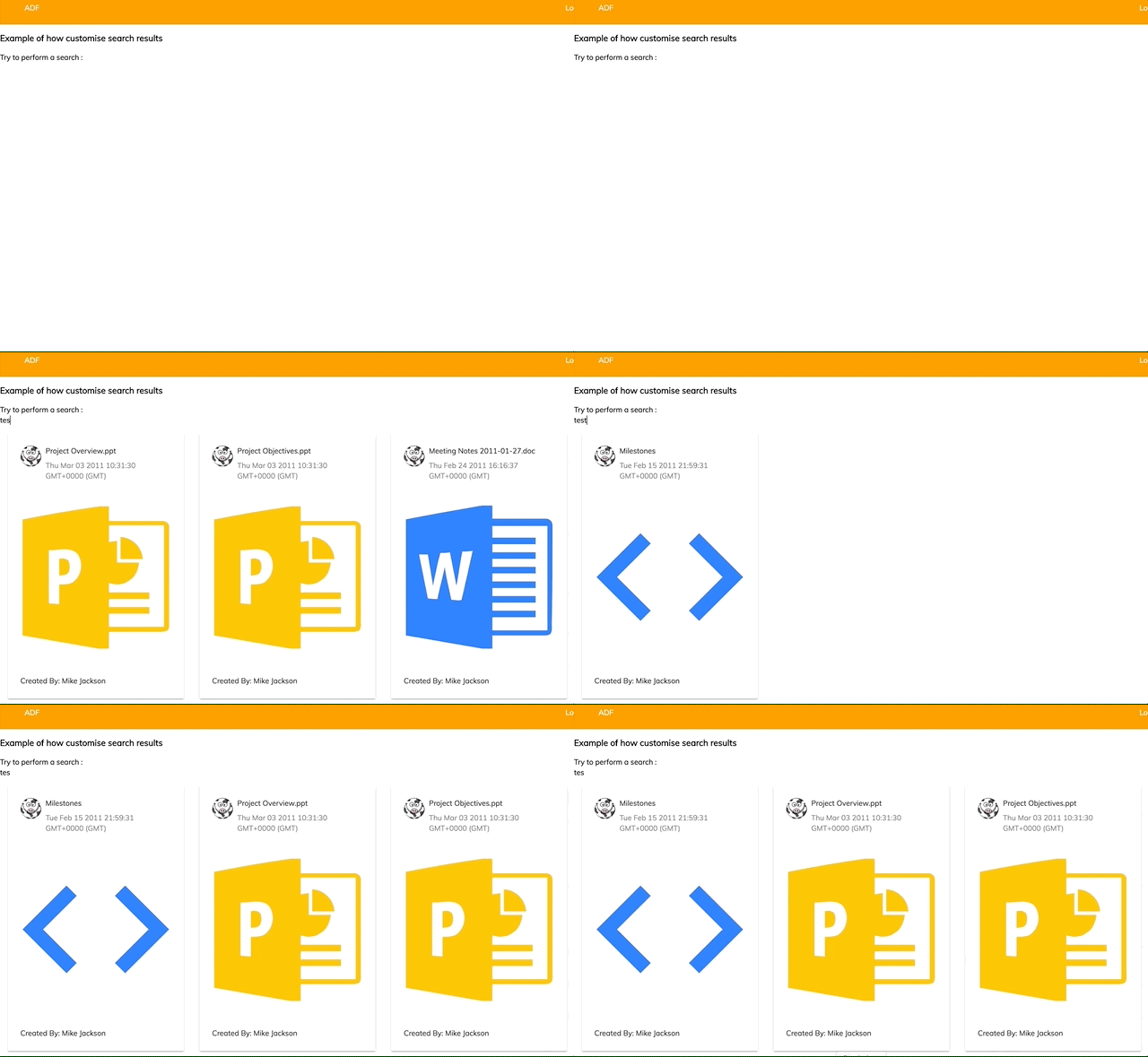
We can use for example the Angular Material cards to prettify the results as in the image below:

This change can be easily reached modify the content of our search-demo.compoment.html templating the results get from the adf-search component in the following way :
<div>
<h3>Example of how customise search results</h3>
<div id="container-for-custom-input">
<span> Try to perform a search : </span>
<input matInput
type="text"
class="example-search-input"
id="custom-input"
[(ngModel)]="searchTerm"
[searchAutocomplete]="auto">
</div>
<div>
<adf-search #auto="searchAutocomplete" class="example-card-search-container">
<ng-template let-data>
<mat-card class="example-card"
*ngFor="let item of data?.list?.entries; let idx = index"
(click)="onClick(item)">
<mat-card-header>
<div mat-card-avatar class="example-header-image"></div>
<mat-card-title>{{ item?.entry.name }}</mat-card-title>
<mat-card-subtitle>{{ item?.entry.createdAt }}</mat-card-subtitle>
</mat-card-header>
<img mat-card-image [src]="getMimeTypeIcon(item)">
<mat-card-content>
<p>
Created By: {{item?.entry.createdByUser.displayName}}
</p>
</mat-card-content>
</mat-card>
<mat-card class="example-card" id="search_no_result"
*ngIf="data?.list?.entries.length === 0">
<p mat-line class="adf-search-fixed-text">{{ 'SEARCH.RESULTS.NONE' | translate:{searchTerm: searchTerm} }}</p>
</mat-card>
</ng-template>
</adf-search>
</div>
</div>
We used the flex layout to style our elements so to show only 3 elements per row.
In order to get the mimetype information we can use the ThumbnailService in the search-demo.compoment.ts
import { Component, ViewEncapsulation } from '@angular/core';
import { ThumbnailService } from '@alfresco/adf-core';
import { MinimalNodeEntity } from 'alfresco-js-api';
@Component({
selector: 'app-custom-search',
templateUrl: './search-demo.component.html',
styleUrls: ['./search-demo.component.scss'],
encapsulation: ViewEncapsulation.None
})
export class SearchDemoComponent {
searchTerm = '';
constructor(private thumbnailService: ThumbnailService) {
}
getMimeTypeIcon(node: MinimalNodeEntity): string {
let mimeType;
if (node.entry.content && node.entry.content.mimeType) {
mimeType = node.entry.content.mimeType;
}
if (node.entry.isFolder) {
mimeType = 'folder';
}
return this.thumbnailService.getMimeTypeIcon(mimeType);
}
}
Last ingredient for the secret sauce is a bit of scss:
.example-card {
width: 200px;
flex: 0 20%;
margin: 15px;
}
.example-card-search-container {
display: flex;
flex-wrap: wrap;
}
.example-header-image {
background-image: url('https://raw.githubusercontent.com/Alfresco/adf-examples/master/ADF_2.0.0/search-customisation-example/src/assets/cowProfile.jpg');
background-size: cover;
margin-bottom: 15px;
}
.example-search-input {
width: 100px;
border: 1 solid;
border-color: black;
}
That's it for our example, you can find the whole example app here. If you have more questions, please reply here or contact us using gitter.
You must be a registered user to add a comment. If you've already registered, sign in. Otherwise, register and sign in.
- Understanding Content Indexing in Alfresco: Configuration, Architecture, and Impact on Performance in Alfresco Blog
- Can't built dependency using ACA-shared in Alfresco Forum
- Paging with adf-search-filter-chips component in Alfresco Forum
- Alfresco Community Edition 7.3 Release Notes in Alfresco Blog
- Missing search-results after migration in Alfresco Forum
