- Hyland Connect
- Content Management
- Alfresco
- Alfresco Blog
- Customising the Alfresco Process Services bundled ...
- Subscribe to RSS Feed
- Mark as New
- Mark as Read
- Bookmark
- Subscribe
- Printer Friendly Page
- Report Inappropriate Content
 This tutorial is part of the Introduction to the ADF APS components and details how to customise the bundled widgets. As introduced in a previous tutorial, a set of bundled ADF widgets are included in the ng2-activiti-form component. More precisely, one bundled ADF widget exists for each bundled APS stencil. This is to say that, by default, if you are going to use the bundled APS stencils and you need a standard behaviour on the ADF application, you can use the bundled ADF widgets and everything will run smoothly. But, what to do if you need to customise something or override an existing behaviour?
In this task we are going to see, as an example, how the text stencil in APS can be customised and overridden in the my-adf application (and in an ADF application in general). As a reference for the ADF widget corresponding to the text stencil (the TextWidget), you can check the source code directly. As you can see, the widget is developed exactly as a standard Angular component, except for the existence of a parent class named WidgetComponent.
Before sharing the technical solutions, let’s identify the text widget into the my-adf application. Below you can see a picture showing exactly where the TextWidget is rendered.
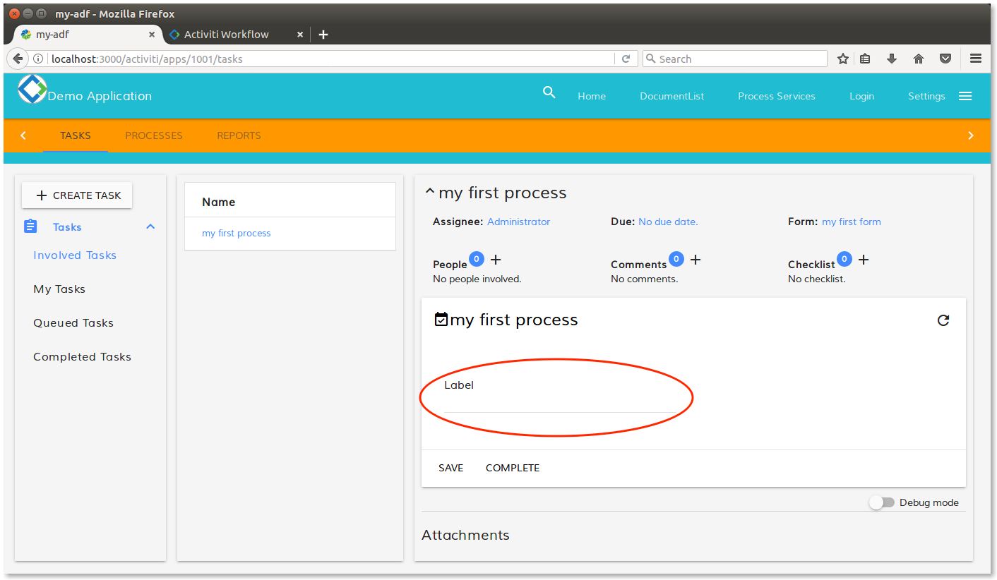
Rendering of the TextWidget into the view.
To override the text widget with a custom widget, there are three easy steps to follow.
1. Developing a custom widget. In this task we are going to develop an inherited class of the WidgetComponent, with our requested behaviour.
2. Adding the widget to the application module (and all the modules that is imported). In this task we are going to include the custom widget to be visible to the components.
3. Instructing the form renderer to use the custom widget instead of the default one. Here, we are going to use the FormRenderingService class, to override the TextWidget.
Below you can find a paragraph for each task, for a more detailed description. After the three steps, another paragraph is going to detail some further customizations and extensions.
1. Developing a custom widget
As a basic and an initial example, we are going to replace the classical input HTML tag of a standard form, with a static text. We can agree that this is a very basic example but at this stage we would prefer to share the basis of the customisations and postpone the complexity for future new exercises.
The very first step, to customize the behaviour of an APS stencil on an ADF application, is the development of a custom widget with your preferred behaviour. To do this, let’s create a new file into the my-adf application, called myTextWidget.component.ts and stored in the <my-adf>/app/components/activiti/custom path (create custom folder if not exists).
The myTextWidget.component.ts file contains the source code shown below.
// Inclusions.
import { NgModule, Component } from '@angular/core';
import { WidgetComponent } from 'ng2-activiti-form';

// MyTextWidget component.
@Component({
  selector: 'my-text-widget',
  template: `<div style="color: red">My text widget!</div>`
})
export class MyTextWidget extends WidgetComponent {}

// CustomWidgetsModule module.
@NgModule({
    declarations: [ MyTextWidget ],
    exports: [ MyTextWidget ],
    entryComponents: [ MyTextWidget ]
})
export class CustomWidgetsModule {}
As you can see, the TypeScript file hosts: the MyTextWidget component and the CustomWidgetsModule module. In a real life project, as a best practice, the component should be stored in a different file from the module. Again: in this example we prefer to merge the two declarations in one file, to make the source code more compact and readable. It’s common (and recommended) practice, to have one file per “object”, for a source code more clean and more maintainable.
Last but not least, we would like to underline something about the MyTextWidget component. As you can see, the MyTextWidget component extends the WidgetComponent. This is a mandatory declaration, if you want the application to recognize this component as widget. For more complex cases, the template source code should be be stored in an HTML file, as we saw several time in past examples of components.
Looking at the behaviour of the class, when the widget will be rendered in a form, a static text colored in red and saying My text widget!, will be displayed for each text stencil we have in the forms.
2. Adding the custom widget to the application module
Now that we have the MyTextWidget component developing our requested behaviour, the next step is to make it visible to the entire application. This task is very straightforward, if you have only one (or few) NgModule into your application. As described in the tutorial talking about the anatomy of an ADF application, in our case we have a unique NgModule declared into the <my-adf>/app/components/app.module.ts file. If you extended the ADF application with other modules, always remember to repeat this task for each module is using the APS forms.
To add the custom widget to the NgModule, change the app.module.ts file as described below.
// Add this import.
import { CustomWidgetsModule } from './components/activiti/custom/myTextWidget.component';

...

@NgModule({
  imports: [
    ...
    CustomWidgetsModule, // Add this.
    ...
  ],
  declarations: [
    ...
  ],
  providers: [],
  bootstrap: [ AppComponent ]
})
export class AppModule { }
As you can see, with this import, we instruct the AppModule to use also the CustomWidgetsModule where the MyTextWidget component is declared.
3. Instructing the form renderer to use the custom widget
Last but not least, let’s instruct the form rendering service to use the custom widget, every time the text field is required in a form. As described in the documentation on GitHub, all the magic happens using the FormRenderingService object that maps the field types to the corresponding instances of widgets. To instruct the FormRenderingService to use the right widget, a command similar to the one described below is used.
formRenderingService.setComponentTypeResolver(
  'text',
  () => MyTextWidget,
  true);
In this command, the first parameter contains the identifier of the stencil (in our case: the text stencil with id text) and the second parameter contains the ComponentTypeResolver, defined as an instance of the MyTextWidget class. The third parameter force to replace the resolver, if it exists already (and this is the case). For a full widget mapping, refer to picture 15 describing the APS stencils, the ADF identifiers and widgets.
Now that we know how to map the form rendering, let’s change the source code according to it. The right place where to act is the view component. In our case the activiti-demo component stored into the <my-adf>/app/components/activiti folder.
Below the changes to the source code of the activiti-demo.component.ts file.
// Add this import.
import { MyTextWidget } from './custom/myTextWidget.component';

...

constructor(
  private elementRef: ElementRef,
  private route: ActivatedRoute,
  private apiService: AlfrescoApiService,
  private formRenderingService: FormRenderingService,
  private formService: FormService) {
    ...
    formRenderingService.setComponentTypeResolver('text', () => MyTextWidget, true);
    ...
  }
Please note that we included the custom widget to be visible to the view component and then we instructed the activiti-demo component, where the FormRenderingService is injected directly in the constructor.
Now that everything is ready for our customised view of the APS text stencil, let’s see in the screenshot below, how the view looks like.
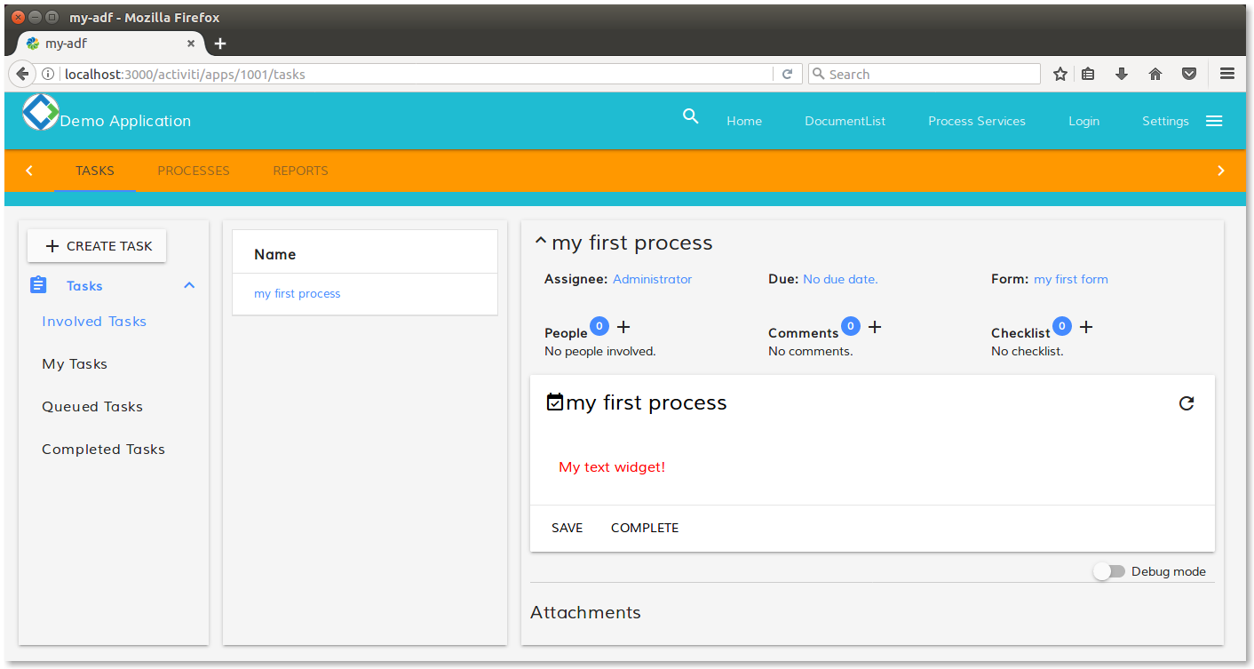
Rendering of the MyTextWidget into the view.
As you can see, where before it was an input field with a label (see the picture above in the tutorial for further details), now there is a red text showing a customised content. As mentioned above, this is a very basic example, useful to share the basis of the customisation. In the next paragraph we are going to see a more useful (but initial in any case) customisation.
About other customisations
Back to MyTextWidget component, let’s modify the template to show a HTML input field, more interesting in practice in a form. In a real life scenario, we would need to have our custom input field instead of the standard one, because we would need to control the behaviour with custom events or checks.
Before changing the source code, let’s install the Angular forms module following the description below. First of all, let’s stop the execution of the my-adf application pressing control-c from the same terminal where the npm start command is running. Once the application is stopped, run the command below from the same terminal.
npm install @angular/forms --save
After the installation, run again the my-adf application with the npm start command. Once the my-adf application is up and running, access to the task list again.
Directly in the myTextWidget.component.ts file into the <my-adf>/app/components/activiti/custom folder, let’s change the source code according to what is described below.
// Add this import.
import { FormsModule } from '@angular/forms';

// MyTextWidget component.
@Component({
  ...
  template: `<div class="mdl-textfield mdl-js-textfield">
    <input
     class="mdl-textfield__input"
     type="text"
     [attr.id]="field.id"
     [(ngModel)]="field.value" />
  </div>` // Change this.
})
export class MyTextWidget extends WidgetComponent {}

@NgModule({
  imports: [FormsModule], /* Add this. */
  ...
})
export class CustomWidgetsModule {}
As you can see, the changes are related to the template and add some more complexities into the attributes of the HTML input tag. More in detail:
- The
idattribute is automatically filled with the identifier of the field, managed from the form component.
- The
valueattribute is filled with the Angular two way data binding syntax. Because of that, you need to include explicitly theFormsModule.
Saving the myTextWidget.component.ts file, the view will be automatically updated as shown below.
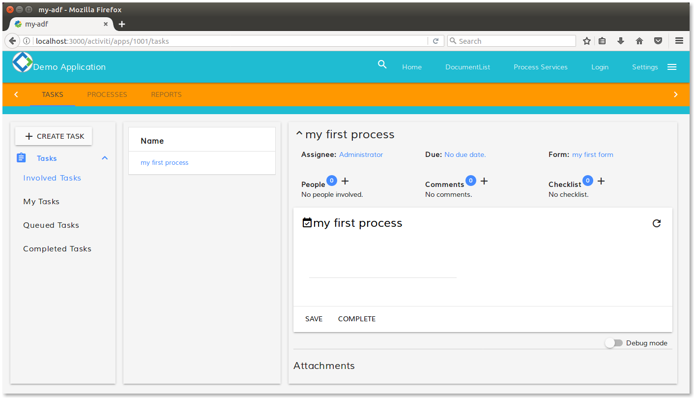
Rendering of the MyTextWidget with an HTML input field.
As you can see, where before it was static red text (see the picture above in the tutorial for further details), now there is an input field rendered by the MyTextWidget component. Before a more complex customisation, let’s spend some words on the “debug mode”. If you look at the bottom right of the view, you can see a switch with a label Debug mode. If you switch it, the result is what you can see in the picture below.
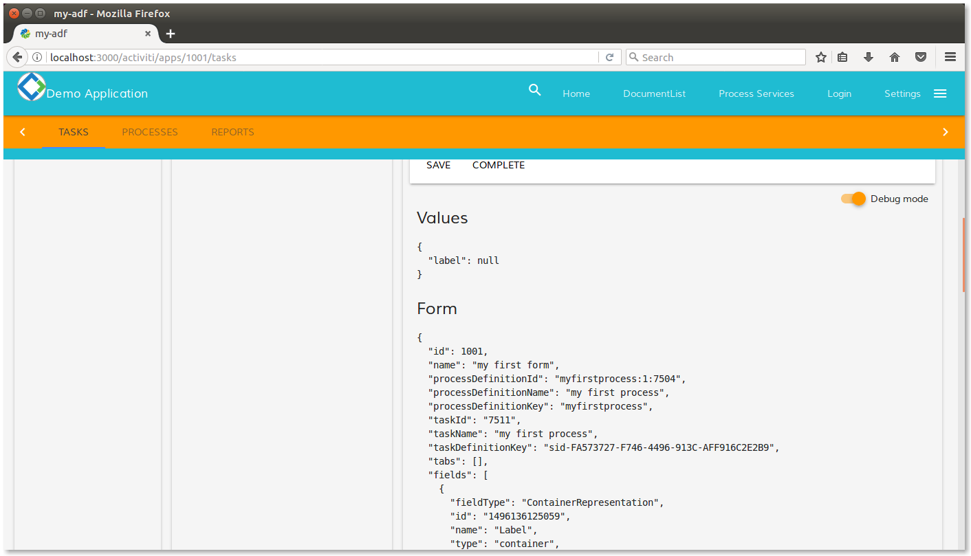
Debug mode switched on into the view.
This features is managed directly into the ng2-activiti-tasklist component and it’s developed explicitly for the developers. More in detail, the feature shows in JSON format the field values and form object directly under the form rendering. This could be an important help for the developers, to understand the context directly from your custom widget into your custom source code.
Going ahead with the examples, another useful customisation that we would like to share is about eventing. Now that our custom widget has an HTML input field, what we would like to do, is to execute a bunch of code each time the value of the field changes.
According with this goal, let’s change the myTextWidget.component.ts file into the <my-adf>/app/components/activiti/custom folder.
// MyTextWidget component.
@Component({
  ...
  template: `<div class="mdl-textfield mdl-js-textfield">
    <input
     class="mdl-textfield__input"
     type="text"
     [attr.id]="field.id"
     [(ngModel)]="field.value"
     (ngModelChange)="greetings($event)"
    />
  </div>`
})
export class MyTextWidget extends WidgetComponent {

  // Add this.
  greetings(event: any) { alert('hi all!'); }

}
As described in the source code, each time the input field changes, the greetings method is executed with a parameter available, representing the raised event. In this very simple case, we are going to show a simple greeting message to check if everything is working properly. In the screenshot below, how the page looks like after the first digit in the text field.
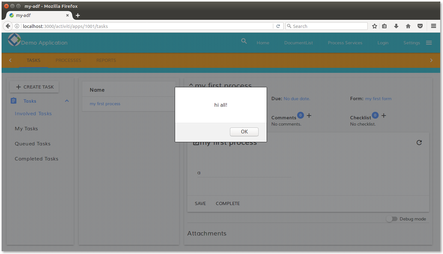
View of the task list after the first digit in the text field.
Even if there is a lot to say about customizing an ADF widgets, in this tutorial we won’t see more than this. For further details about form extensibility and customizations, we suggest to look at the documentation available in GitHub dedicated to this topic.
You must be a registered user to add a comment. If you've already registered, sign in. Otherwise, register and sign in.
- Trying to get application to run in Alfresco Forum
- Alfresco Community Edition 25.3 Release Notes in Alfresco Blog
- Alfresco 6.1.2 + Solr (AFTS): Exact phrase search not working in Alfresco Forum
- Alfresco Developer Resources in Alfresco Blog
- Howto upgrade Alfresco Community Edition 7.0 to Community Edition 7.1 with docker compose? in Alfresco Forum
